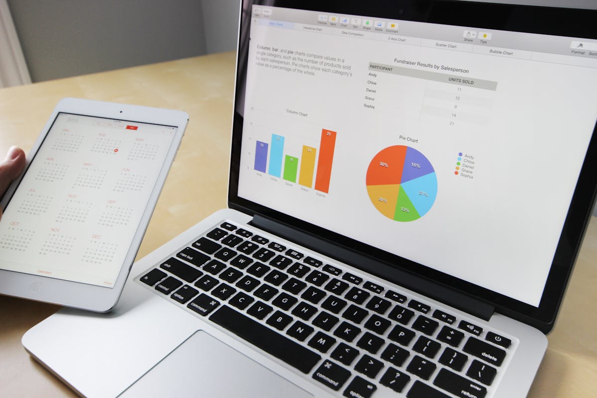
In the world of NGOs and charitable work, we often rely on numbers. Pie charts, bar graphs, and impact reports are used to communicate progress, measure growth, and attract donors. But sometimes, in the neatness of percentages and the precision of data points, we forget one essential truth:
Behind every chart, there’s a child. Behind every graph, a dream.
That 86% literacy rate? It’s not just a number. It’s Riya, a 10-year-old who learned to read her first book this year.
The 72% increase in nutrition support? That’s Mohammed, a 6-year-old who now receives a daily meal.
The 64% skill training completion rate? That’s Sunita, a single mother who just opened her small tailoring shop.
The Human Story Behind the Data
As an organization striving for impact, GEP Foundation uses technology, data analysis, and dashboards to track every rupee spent, every class conducted, and every life touched. But we never lose sight of why we do this — for the people.
Each line on a graph represents not just a service delivered, but a story of resilience. Each upward trend is not just success in operations, but a sign of human progress — made possible by collective effort, compassion, and your support.
When we say “200 children enrolled in school,” we’re not talking about faceless numbers. We’re talking about 200 young minds being ignited. Futures being rewritten. Dreams beginning to take shape.
Data with Heart
Transparency and accountability are crucial in nonprofit work. Donors want to know how their funds are used. Stakeholders want to measure impact. That’s why we use reports. But we believe that data should not just inform — it should inspire.
Our team combines hard numbers with soft stories. Alongside every quarterly report, we include real narratives. When you read that 300 families received winter kits, you’ll also read about Lata Devi, who could finally send her children to school without worrying about the biting cold.
Why This Matters
In a world flooded with content, numbers grab attention. But empathy holds it. When you give to a cause, you’re not donating to a statistic. You’re investing in a life, a journey, a dream.
Graphs can’t cry. Charts can’t laugh. But the people behind them can — and they do, every time someone like you chooses to care.
Your Role in the Story
Whether you’re a donor, volunteer, or well-wisher, remember that your actions don’t just create metrics — they create miracles.
So the next time you see one of our reports or an infographic full of figures, pause for a moment. Picture the faces behind the data. Think of the child who can now dream of becoming a doctor. The mother who can now feed her family. The youth who now believes in their future.
Because behind every chart, there’s a child. Behind every graph, a dream. And behind every act of kindness, someone like you.
Be part of this change. Let’s turn more numbers into names, and more graphs into hope.